4.29.2014

Rental Dilemmas: My Basic Beige Bathroom

There is a part of my apartment that you all haven't seen much of, and that's my bathroom.
Functionally, my bathroom is perfect. Firstly, it's giant. It's got a large soaker tub, a huge shower, and a decent sized vanity. There is also a large window so I have ample natural light. The layout is also ideal, and the fact that I don't have to share it is pure bliss.

Aesthetically...it needs a bit of work. There is nothing really wrong with the way it looks. It's fine. My instinct as a designer is to replace all the tile with something fabulous and paint the vanity blackt, but let's face it, this is a rental and the fixed elements are not changing. Not only would my landlord say no, it also doesn't make sense for me from a financial perspective. But, I am thinking I could spruce it up for around $100.

Take a look at its current state:
^ Call me crazy but I actually kind of like the light fixture. I know it's super outdated, but it reminds me of an old Hollywood starlet dressing room. Things I don't love (but cannot change), are the  plain mirror, the counter top, faucet, light oak vanity colour, and the boring beige tile floors....so pretty much everything.
^ I do like the toilet. It's fairly small and nice looking. 
^ I love my tub and the big window. Again, the tile is not my favourite but atleast it's neutral.
^The view of my shower.
I also currently have pinky corally bath towels hanging on the wall opposite my vanity:

I'm thinking it needs a few minor tweaks to make it look a bit more cohesive, and a lot more styled.
Even though it's perfectly clean and tidy, it looks kind of hodge podge and cluttered to me.

I saw a small graphic black and white rug at The Home Depot that I am considering to replace the boring brown one I currently have. I put my black and white pillow down to get an idea of how it would look, and I'm liking the contrast:
I also think that the black and white help to make the fixed elements feel more 'goldy', which I like.

I also know that I can't change the mirror, but lately I've been seeing a lot of 'mirror on mirror' in bathrooms.... I wonder if there is a way I could put my octagonal mirror on top of this one in a non-permanent way....

Lastly, I'd add some chic accessories, and paint and hang a couple of abstract black and white paintings. I did a quick twenty minute brainstorming sketch:
What do you guys think?
xox
Photobucket

4.23.2014

Art for my Music Loving Boyfriend

I don't think I've told you yet, but M. is an amazing musician - singer, songwriter, plays the piano. Really, could I be any luckier? I love listening to him play music. He's recording some new stuff right now, and I can't wait for the day I can share it with all of you! In the meantime, I noticed two spaces recently that featured art that I think my music loving boyfriend would like. I'm not talking music notes or treble clefs on the wall (no offense to anyone with large music notes on their wall...just not my thing), but really cool pieces.
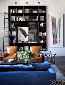
Johnny Buckland's Home via Elle Decor
^This is the home of Johnny Buckland (the drummer for Coldplay) featured in this month's Elle Decor. I loved the entire home tour, but this painting of record spines really caught my eye. M has quite a substantial vinyl collection, so this piece is kind of perfect. It's by artist Dave Muller, who has painted a variety of record spine collections at large scales like this. I love them!

Photo by AC for Tompkins Lloyd Interiors via Mimosa Lane
 ^ My blogging friend Albertina of Mimosa Lane photographed this gorgeous home, and as soon as I saw this vintage boombox art I thought of M. It adds a nice graphic element to this space (and let's not even start on the burled wood end tables!).

One day in the future, I might have to consider merging his style and mine, and I have to say, these pieces would make it pretty easy!
xox
Photobucket

4.14.2014

Black Bathrooms

I have black bathrooms on the brain. They are moody and sexy, yet somehow relaxing all at the same time. It all started with Jenna Lyons' bathroom that everyone fell in love with when it appeared in Domino back in 2008, and from there, my obsession has only grown and grown.
Jenna Lyons via Domino November 2008
Mark D. Sikes via Domaine
Gaby Burger via The Vault Files
via Lonny June/July 2010
via Cupcakes and Cashmere
I love Emily's recently unveiled powder room in the last image. It actually reminds me a lot of this powder room I designed for school a year ago! (read more about the project here and here) :

How do you guys feel about the whole black bathroom thing? Would you, could you?
xox
Photobucket

4.10.2014

Cane Chair Score

If you follow my instagram account, then you might have seen this beautiful cane chair that I picked up at Good Will for $10 last week (excuse the iPhone picture..read more about the mirror here):
 I was so happy when I found this. I have been looking for a cane chair just like this for well over a year now. Last summer, I saw one at the flea market but they were asking $90. My best friend Laura major low balled for me and we basically got kicked out of the booth. Good times.
But, I'm glad I held out because this one is gorgeous, in great condition, and a great price! Ideally though, I'll be able to find a partner for her, and a great reupholstery fabric.
I  might leave the wood natural though...just touch it up a bit...is that crazy?:
via Lonny February/March 2010
Do you think this is an upholstery job I can tackle on my own? I am an upholstery virgin, keep in mind.My girl's Hannah and Elizabeth were able to do some amazing cane chair makeovers! Check them out.
xox
 
Photobucket

4.09.2014

Leopard Print Prints

Who doesn't love a good leopard print? And what about a leopard print print. Are you following? I have two leopard print prints in my own space, and I must say that as far as I'm concerned they were made for each other. Together, they are making my desk area so lovely.
The 'As far as I'm concerned leopard is a neutral - Jenna Lyons' print is from SS Print Shop.
The YSL leopard loafer print is from The Aestate.
How do you incorporated leopard print into your own decor? Let me know in the comments below.
Photobucket

4.08.2014

Octagonal Mirrors

A sculptural mirror can have such a big impact on a space, simultaneously acting as both artwork and a reflective surface. This is why I was so excited when I found this lovely octagonal mirror while I was out thrifting last week:

 I found it at Good Will for a mere $4, and knew it had a tonne of potential.
When I got home, a Pinterest hunt led me to some mega inspiration:
Amy Perlin, originally published in House and Garden, August 2005 via Architectural Digest
Sean McNally via Lonny
Raúl Martins, originally published in Nuevo Estilo Magazine, via Habitually Chic
via Pinterest, original source unknown
For now I have mine hanging in my newly organized closet (more on that later...I need to get a better light bulb before I can photograph it). I'm still deciding how to refinish my mirror, but at the moment I'm leaning towards tortoise shell. Any thoughts? This is a project I might not tackle until my next apartment, where I will hopefully have more space to display it in a more prominent spot.
xox
Photobucket

4.07.2014

Warby Parker X Architects for Humanity

 Gone are the days when wearing glasses was uncool. Today, being a 'four eyes' is so damn chic people are wearing fake lenses just to look good. No joke people.
I have to say, I think much of this is owing to Warby Parker, a company that produces stylish glasses at an affordable price. To top it all off, for every pair of glasses that Warby sells, a pair of glasses is distributed to a person in need. I love that. That is worth celebrating:
via Warby Parker Class Trip
Now, to do even more good, Warby Parker has teamed up with Architecture for Humanity just in time for AfH's 15th anniversary. For the last 15 years, Architecture for Humanity has been providing "vulnerable communities with vital, innovative and most of all community-driven architectural, planning and construction services". Together, these companies have collaborated to create 2 exclusive new frames (Aslin and Fowler) which are inspired by an appreciation for streamlined angles and built to last materials like Japanese Titanium and Warby's signature acetate. Plus, they look absolutely lovely. Today is the release date of this inspiring collaboration!


And if all that good deed doing doesn't inspire you to buy a pair, perhaps a little inspiration of a couple of fabulous ladies in their fabulous Warby Parkers (of various styles) will:
p
via Styled Avenue
via Warby Parker Class Trip
Doing good is always in style in my books!
Read more about the collaboration and how you can contribute here.

Photobucket

4.02.2014

Term 6 Final Project: Historic Building Adaptive Reuse

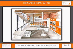
I cannot believe that I am already done 6 out of 12 terms! Time is flying. A year and a half ago I began my interior design journey and now I'm half way to having my Bachelor of Interior Design Degree. This term, our big project was converting a four story historic building into a modern use space. This was our first group studio, and it was a great experience working with 2 other students (and friends) Kelsey and Aram, to complete the final project! We chose to turn ours into a nutrition facility which includes a healthy eating restaurant, fitness studio, cooking classes and nutrition consultation offices. It was a huge amount of work, but we did it! Here are our final presentation boards:
Glad it's over! I've been enjoying two weeks off but next week it's back to business!

Photobucket