12.26.2015

Oh Chrismas Tree 2015

Oh my gosh! Another year has gone by (with a dismal amount of blog posts on my part) and it's time to take down the Christmas tree already! I shared photos of my tree on instagram, but it is my first real tree since moving out and it deserves a blog post all of it's own. I filled the tree with vintage ornaments passed down by my parents and Babcia. I love the classic Christmas colour they provide.
 
Proud moment: Hauling the tree up to my third floor walk up apartment and getting it set up all by myself.
 Now for the lights and decorations!


 You just can't beat the smell of a fresh pine tree, it is truly the magical smell of Christmas. I hope you all had the most wonderful holiday season. Thank you for sticking with me despite there only being a few posts this year. I love you all!

xox
Photobucket

12.01.2015

Setting the Table, Sarah Style


I'm dreaming of a pink Christmas with this darling festive tablescape that I put together using Sarah Richardson's new textile line! These colours are perfect for year round, but the motif on the cotton napkins reminded me of snowflakes, which inspired me for the holidays. Place settings topped with coordinating Christmas tree decorations add to the fun and cheer, and are a great little 'take home' gift for friends. Speaking of gifts, wouldn't these table linens make a great one?


 Here are my top five tips for creating an effortless Christmas table setting:

1. Mix metals! A little brass, a little silver - it all works during the holidays, so don't worry if your cutlery doesn't match your glassware.
2. Create a no fuss centerpiece using seasonal greens such as Seeded Eucalyptus and fresh berry branches.
3. Candle light and Christmas tree lights set the perfect mood when the sun goes down.
4. More is sometimes more. My tiny table achieves big style by layering textures, colours and pattern.
4. Sarah's new linen line comes in four colour palettes making it easy to look like you spent hours decorating the table. The placemats are reversible, and everything is cotton and easily washable.

xox
Photobucket

11.30.2015

Mantel Makeover: Holiday Edition


With the holidays fast approaching, two things in particular about my new apartment were making me very excited for Christmas decorating. The first was that my place is big enough to get a big tree (remember the teeny little tree I've been using for the past couple of years?) and the second was that I had a mantel to style up! 

I kept it pretty simple with natural elements and classic red and green to give the mantel some holiday cheer. I wanted it to feel very traditional, sophisticated and (of course) beautiful.

A quick trip out to my favourite local florist proved successful. The flower shop is such a magical place at this time of year, filled to the brim with all the trimmings for gorgeous bouquets, wreath and garland making. I picked up a lovely foxwood wreath, a large swag of leyland cypress branches, fresh red berry branches, and a big bouquet of seeded eucalyptus (for a center piece). I also grabbed some logs to fill up the fireplace - purely decorational as my fireplace is non-functioning, but I think they really add to the cozy feeling! I didn't do anything fancy, just hung the wreath with some fishing wire, tied a big bow and laid the branches out on the mantle. I like the lush, semi wild look this achieved.


Oh I just love Christmas decorating! Have you decorated your mantel? Link to it in the comments below!
xox
Photobucket

10.19.2015

DIY Ikea Hack Chest of Drawers

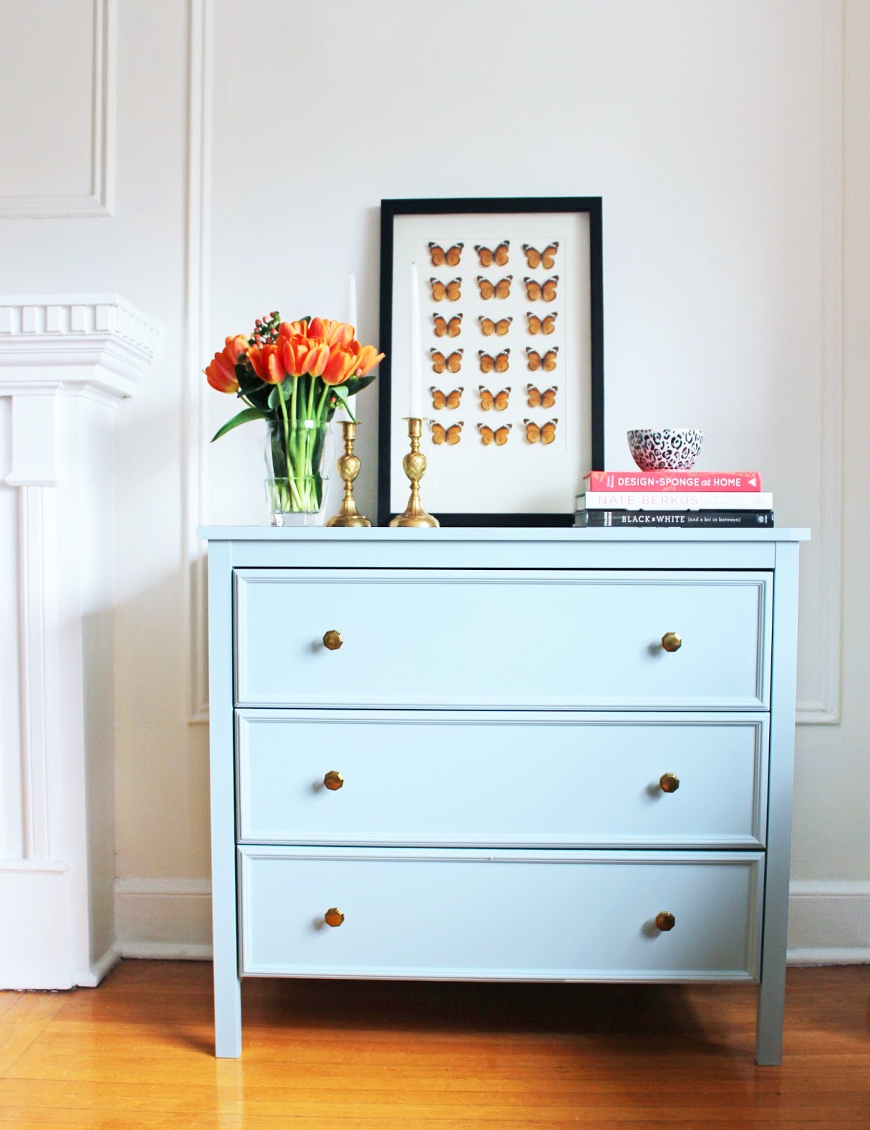
Ever since moving into my apartment in May, I have envisioned a pair of small dressers flanking my fireplace. This is one of my favourite looks and it also provides some much needed storage for my board games, dvds, cozy blankets for watching tv, etc. My dream was to find a matching vintage pair, but this proved to be a challenge. Vintage pairs of anything are hard to find, and because of their rarity are usually pretty expensive when you do finally find anything. I decided that for now, the best plan would be to try my hand at an ikea hack.

I bought the KOPPANG 3 drawer chest. I liked the simple lines as a nice blank canvas and the price was right.
I did the rest of the steps after assembling the dresser, but if I were to do it again I would add the trim and paint everything before putting it together to make the job easier.

Next I bought some small decorative trim from the Home Depot and used a saw and mitre box to cut it. I glued the trim pieces onto the drawer faces using No More Nails glue and filled in any gaps in the mitred corners with paintable caulking. The trim really helps to make this streamlined piece look more traditional.

Next came priming and paint. I used the Zinnser Shellac Based primer (which Jenny of Little Green Notebook swears by for painting IKEA furniture).  I painted out the dressers in a beautiful robin's egg blue called Cape Hope by Beauti-Tone paints.
Lastly, I switched out the cheapy-cheap black plastic knobs that came with the dresser for some pretty brass octagonal knobs that I got a liquidation shop in my home town for only $2 a piece and voila!
I think that the dressers now have that vintage/traditional look that I was hunting for. It's also my first time owning any painted furniture, and I have to say, I'm loving the dose of colour!!


The place is really coming together! In the living room all that's left to do is a buy few accessories, get my cane chairs reupholstered, sew a couple of small lumbar pillows and paint something big for over the sofa. In an ideal world I would also ditch that ceiling fan. Have you ever done an ikea hack? Share the link in the comments and I will be sure to check it out!

xox
Photobucket


9.30.2015

A Library in the Dining Room

Hello friends! It has been awhile. I took the summer off to really focus on getting settled into my apartment and enjoying the warm weather, as well as take a much needed rest after graduating from the Bachelor of Interior Design degree in only 33 months. Today, I'm giving a little sneak peak of my dining area which is going to double as a library with the help of a really lovely IKEA billy bookcase hack (more to come on that one I get the shelves secured to my old plaster walls). 


For as long as I can remember, I've wanted a library. Before my Design Degree, I graduated with a degree in English Literature, so I guess you can say that books are my first love. But being in a small apartment in the city means having to get creative with space.

I was inspired by this library designed by Nate Berkus:
Image via Architectural Digest, November 2012

Combining the dining room with the library is such a natural choice, as the table easily doubles a surface for reading, studying, and note taking. Let's just say the grass cloth got me thinking as well!
I can't wait to show you the rest! Stay tuned for more from my apartment decorating.

I've missed you my friends!
xox
Photobucket

4.14.2015

Fireplace Facelift: A Rental Friendly 'Marble' Makeover


One of the things that I knew I wanted to change in my rental was the yellow tile surrounding my fireplace. I'll admit that once I moved in, the yellow tiles grew on me. They were more charming than I originally guessed, but I still felt that they weren't in keeping with my overall style and vision for the space. A couple of them were also cracked. (And yes, the ceiling fan is another thing I'd like to change!)


The tricky thing is that this is a rental unit, so I have to be realistic about what I can change and what I have to live with. I want to retile my kitchen backsplash eventually, so I'm saving the 'ask the landlord' question for that. Furthermore, I wanted marble and I know that it's not in the budget, and investing a lot of money into a rental doesn't make sense for me.

What I really needed was a rental friendly, non-permanent, easy, no-hassle, and inexpensive solution.
And that's when it donned on me, what about something I can peel and stick? So that's exactly what I did! I ordered up this amazing contact paper from my friends over at Design Your Wall, and went to work. A quick note about this contact paper. It is SO thick and durable, some of the tiles I had to unpeel and restick over ten times to get it just right, and the paper didn't rip, crinkle, or lose its stick. It really feels almost more like vinyl than paper. It is even wipeable! The pattern is also extremely realistic. 


The contact paper comes with a great grid on the back, so it makes it really easy to cut straight lines.

Next, just peel and stick! (and swear and get frustrated and almost give up). I'll be honest, I found this part difficult because part of my tiles are in behind the copper insert, so to peel and stick while getting it in behind there was very tricky. Thank goodness I could peel up and restick so many times!
I used the small triangle to help smooth out any air bubbles as I went. You should also make sure that your tiles are clean and dry before sticking.


I used the utility knife to reveal grout the small grout lines if the paper was covering it.


And voila! I can't believe how great this project turned out. I still need to add some caulking around the perimeter just to hide some of the pre-existing gaps, but I am loving the transformation! This really was the perfect solution! I don't think you can tell that it is paper at all unless you get really close. A big thank you to Design Your Wall for such an amazing product!

Now I'm thinking about what else I can marble-ize!
xox
Photobucket

4.13.2015

New Apartment Part 1: The BEFORE pics & tour

Hi loves! 
If you follow me on instagram, then you know that my apartment is no longer empty and that I'm settling in quite nicely, but I wanted to share some quick snaps of the place before I had all my things moved in, and before I painted every wall, ceiling, trim, door, etc. to give a full idea of what it looked like in the beginning. It's hard to tell in the pictures, but the walls were a light tan colour and the trim was a yellowy-cream.

^ This picture really captures all of the main things that made me fall in love with this place. The original hardwood floors (with that lovely inlay detail around the hearth), a gorgeous fireplace and mantle, picture frame mouldings, big baseboards and crown mouldings, and high ceilings. The space also has really great natural light.


 ^ Here is another view of the family room with a peek into the dining nook. Some of my furniture is sneaking its way in by this point. Here you can see the charm of the rads, and more moulding details. There is a big spot on the original wood floors, but luckily my area rug covers it now. This also gives you a better idea of the dingy wall and ceiling colour. The small kitchen is behind the wall to the right of the photo.


^You can see the front door and front closet in this picture. Off that hallway is my bedroom and the bathroom. I love the big opening that leads from the hall to the main living space! I need a solution for the ceiling fan...


^Another look at the hall with a sneak peek into the bedroom.

^The bedroom, which is surprisingly big! Sadly I had to sleep on the sofa for 5 nights until my new mattress got delivered. Well worth it to have a queen bed though!

^Good news! The closet is a great size! Not as big as the lovely walk-in at my old studio apartment, but still a huge amount of storage (there is a big shelf on the left side that you can't really see here) and nicely set up with a closet organizer.

^The remainder of the hall. 2 small storage closets on the right and a door to the washroom at the end.

^My sweet little washroom with amazing floor tile. I apologize that the toilet lid is up. I was also testing some wall colours by this point.

^The dining nook, which is a great size. It's open to the kitchen. M. was filming a cover video here that day, which explains all of the music gear. You can check it out on his youtube channel here.


^ Okay yes, my kitchen has terrible purple tile floors and backsplash..but other than that it is really great. I love the appliances, (and there is a dishwasher!!! Major bonus), there is tonnes of storage and a nice window. I'd love to replace at least the backsplash...I'd only need about 20 sq.ft. and I don't think it would be too hard. Ideally I would do the floor as well, but that seems like a big job and I'm not sure my landlord would go for it. Maybe a nice little kilim rug in here instead? Does anyone have any advice on rental kitchens?

^This is the last shot before getting to work painting (it took about 5 days to paint pretty much every paintable surface). 

Hopefully from these pics you can see what I saw when I first looked at the space: Serious Potential.
I can't wait to show you the progress I've made already! Stay Tuned.

xox
Photobucket