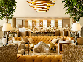
Hi guys, I promise that next Friday I'll try to get back to the usual Fave Furniture series, I've just been settling in to school and such.
Speaking of which...Today I have my first drafting assignment! I'm so excited but a little bit nervous.
It's basically aimed at getting us used to the different drafting tools, as well as to learn the universal lettering style of the industry.
For next week I also have to "choose and interestingly designed object or project, such as an interior space, building, art work, piece of furniture, etc." to perform an architectural analysis on.
This means exploring issues such as shape, form, line, vertical and horizontal elements, etc.
While most of the suggestions given to us were of older historical artists and projects, I'd really like to discuss the lobby of The Tides South Beach Hotel, designed by Kelly Wearstler (who else could I choose!? She really packs so much drama and interest into a space).
I mean...gorge. Am I right?
I hope that the prof approves this one!
For more goodness check out the dining space of this hotel (also designed by Wearstler):
Woah, woah, woah. I'm going to have to work a picture of this into my presentation. I'm thinking to demonstrate the lines of that cool white and gold folding-screen-looking wall treatment, which is also used in the foyer (see the first image).
And those mounted tortoise shells seem totally relevant this week, what with Nate Burkus's Target line launching this week and all...The white shell is my fave thing in the collection I think!
Wish me luck y'all!
What designed object or project would you choose if you had this assignment?
xo


.jpg)


The driftwood in the first photo is fabulous!! I would love to have something like that in my home!
ReplyDeleteBeautiful photos!!! Good luck with your assignment- you'll do wonderful!
ReplyDeleteXo-L
simplylowcountry.blogspot.com
The spaces Kelly Wearstler has done are out of this world!
ReplyDeleteHave fun in class....Study hard, you have a fantastic life ahead.
That Kelly - she is so fab! I think this room will be awesome for your assignment!!
ReplyDeleteThe mix of it all is what is getting me. Tufted sofas, driftwood, all of it.
ReplyDeleteGotta love some Kelly :) I'm so excited to hear how it goes. And. ahem. yes, I spotted Nate Berkus tortoise shell at his launch party...love love.
ReplyDeleteIt is wonderful
ReplyDeleteThese are great pics...and the place is beautiful :-)
--------------------------------
Welcome to my blog
http://www.homedesign9.com/
Interior Decorating, Home Design, Room Ideas
Isn't Kelly fabulous? Went to the Viceroy in Palm Springs last month and was blown away! Good luck on your assignment!
ReplyDeleteI remember the Tides before Kelly's design and it is now a major WOW. Great pick! Not only should your professor approve, he/she should send you to South Beach to thoroughly explore the space and compile a major report which you would promptly do while chillin poolside! Good luck lady.
ReplyDeleteomg im obsessed with kelly's work!! she is incredible! thanks for all your lovely sweet comments :) adore your blog! you remind me of myself lol...good luck on your drafting project!! xoxo
ReplyDeletegood luck with your assignment tiffany! That hotel looks amazing. So chic and unique. Love the turtle shells on the wall!
ReplyDeleteI love those shells too! they're already sold out online, so I'm going to have to hunt them down at a store :)
ReplyDeletexo SideSmile,
Ashley
SideSmile Style
She really is so, so amazingly talented!!
ReplyDelete