3.28.2013

Paint by Number Ballerinas: Buy or Pass?

 
I spotted this exact pair of vintage paint by number ballerinas at Value Village the other day and I kind of can't get them off my mind.  I can't help but think how fabulous they would look in a nursery (future clients?). There is something so whimsical, quirky and fashionably kitschy about paint by numbers. I might pop in after work and see if they are still there.... At 15$ a piece they are a bit pricey for Value Village in my opinion, but I still think a good value over all.

What do you think? Should I buy them or pass?
Also, I would love it if you guys checked out my Term 2 Final Project that I posted yesterday! It's the condo I've been talking about for the past little while finally complete. It was a lot of hard work and I am proud to show it off ;)
Photobucket

3.27.2013

Term 2 Final Project: Condo Design

In case you're wondering where I've been the past couple of day, the answer is holed up in my room crafting away. I've never crafted so hard, I actually woke up stiff today....who knew that was even possible?!
But finally, 8 presentation boards, a small fortune and over 100 hours of work later, I am done my term two final project! I'm thrilled to be able to share the final product with all of you today! Cue the photo overload (and the champagne):


I am really proud of the way everything turned out. When I look back at my Term 1 Final Project, I am in disbelief at how far my skill set has improved in just three short months. I can't even imagine what I will be able to do by the end of my final term, Term 12!
Photobucket

3.22.2013

Armless Sofas & Where to Use Them

I love the look of armless sofas. So clean, elegant, and streamlined. The arms on sofas can really create a lot of visual bulk, so this is a good option if you want a lighter look.
via MMR Interiors
via Joe Nye Inc.
For me, it's all about using these beautiful pieces in the right setting because there are some situations where I feel armless is just not the way to go.

Firstly, I would avoid using one as your only sofa option in a TV area. Speaking from personal experience, they are not very comfortable to sprawl out on to watch TV. There is no where to rest your head if you want to lay down, and if you try to pile up pillows for the head rest they end up slipping off eventually. I, for one, have a very difficult time watching TV in an upright position. Bring on the cuddling, blankets and popcorn puh-lease!

 An armless sofa can also cause problems when multiple people are sitting on it because you can't lean away from each other! Arms allow you to lean away from the person next to you, giving you your personal space and allowing you to comfortably look and chat with eachother. With nowhere to lean, this is only achieved with the uncomfortable neck turn.

For me, it's all about using these beautiful pieces in the right setting, such as a more formal seating area, a dining space, and smaller areas like a foyer. They are also great as a secondary seating option in any room.
via Elle Decor
via Habitually Chic
via Lonny
What's your take on armless sofas? I'm personally lusting over the first and last examples!
xox
Photobucket

3.20.2013

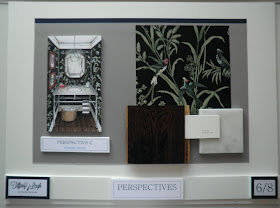
Rendering Wednesdays: Powder Room

Remember when I used to post a doodle every Wednesday? I miss that. So I thought today I would share a rendering that I did for my final condo project (which I hope you guys are not sick of hearing about yet because it's consuming my life at the moment therefore all I really have to talk about!).

Last week I shared the wallpaper I have chosen for the powder room with you. I loved the little moodboard so much that I decided to try my hand at rendering the space for my presentation boards!

Mirror (vintage) / Sink&Vanity / Hand Towel / Basket / Pendant / Mineral Art Work

I also rendered the kitchen yesterday, and am starting the living room today!
Learning to draw in perspective and render this term has been so much fun because it allows me to really envision my designs come to life. I think it will be a great tool in my designer belt!
xox
Photobucket

3.19.2013

The Prettiest Chandelier I've Ever Seen

Can we just discuss this chandelier for a moment:
 I personally, cannot, as I'm left rather speechless by it. I've always loved murano chandeliers, and the bubble gum pink is almost more than I can bear. And the fabric on those louis chairs?! Heavenly.
This is the house of Pete and Bailey McCarthy as featured on Design*Sponge. It's pure amazingness, a big thanks to Elizabeth for tipping me off to it. I dare you to count their bathrooms!
xox
Photobucket

3.18.2013

Black Framed Showers

I've always loved the look of old (or new) black framed windows. I think it's such a handsome, masculine and historical look. That's why as of late I'm really enjoying the black framed showers I've been spotting on Pinterest!
via Pinterest
via M Rodgers Ltd.
Bailey Mccarthy via Design*Sponge
^That last image seriously has my heart. The gold, black and white is such a classic and glamorous combination!
What do you think of this look?
Photobucket

3.14.2013

Wallpaper Weigh In & Guest Post on Bijou and Boheme

I'm beginning this post with some exciting news....a nursery moodboard that I created is being featured on the fabulous Christine's blog Bijou and Boheme today! Please be sure to check it out.
If you saw this post, you already know I'm a huge fan of Christine and her gorgeous blushy home!

I spent yesterday scouring the sample room at my school to find the perfect wallpaper for the condo's powder room and potentially the foyer. I knew I wanted something dark, moody and potentially with an air of chinoiserie. This is what I found and I'm pretty obsessed and shocked because usually the sample room is pretty picked over. What do you think?:

I love how it looks painted, and it sort of reminds me of Nina Campbell's Parroquet, but all grown up:
 

 In the foyer I would probably just frame a large piece to go on top of the teak credenza, like this:

And in the powder room (because it is small and you don't spend a tonne of time in there so it's the place to really go balls out) I would do the entire thing:
For those of you wanting a source, the wallpaper is 'Augustine' by Thibaut.
Time to weigh in ladies!
And if you need to catch up on the condo project, you can check it out here and here!
xox
Photobucket

3.12.2013

Studying...

Can I please look this glam while studying? Maybe I should go sit in the tub...
Test today and paper tomorrow! Thanks for understanding the lazy post.
xox
Photobucket

3.11.2013

Condo Design: Second Level

If you missed the first level of the condo I am designing for my Design Studio term project, you can catch up here. The first floor was all about open space entertaining, and a chefs kitchen for Mike.

Today, it's all about the second floor and all about Alicia, who wanted a cozy and colorful home office to do her writing from. Here is the plan:


When you come up the stairs, there is a bit of an awkward but spacious landing. I decided to put a small laundry closet here, as well as a little bench and a console which can be styled up really nicely.
I love the shape of this desk that Lindsay shared the other day:
via Sadie and Stella

 On the other side of the staircase is Alicia's office, which overlooks the first floor. For the desk, I knew I wanted to repurpose the couple's existing dining table here:
It's the West Elm Collapsible Saw Horse Table, no longer available. They love this table and so do I. Also, Alicia is getting a bright and cheerful tribal Rug:

via Rugs USA
This area is also going to double as a guest bedroom. Rather than choose a pull out sofa, I thought that a day bed (from West Elm) would be a good look and add to the laid back vibe of this space:


I am going to cover the mattress in this La Fiorentina fabric:

I had it picked out before I spotted this picture on Alicia's Pinterest:
via
 Looks like we are speaking the same language ;)
Even though the space is open to the floor below, I think the deep burgundy tones amp up the coziness factor. I know I could get lots of work done in this pretty space!
xo
Photobucket

3.07.2013

Room on a Budget

Today I'm over at Champagne Lifestyle on a Beer Budget Sharing some tips for decorating on a budget. We all know that as a student, I'm always looking to stretch my pennies!

Hannah herself is amazing at style on a budget.
Remember this chair makeover?:
via Favourite Furniture Fridays
All her!  Be sure to check out my guest post here!
Photobucket