


I did it! I survived my fourth project week.
This one was a big one - Each term more is expected of us as our knowledge base grows. I can't believe I'm officially 1/3 done my degree already. How time flies!
Today I thought I would share my final project and some tips for creating professional looking design boards (for all those fellow design students following my blog! xo)
 1. Be consistent. All of your boards should look exactly the same if you were to take all of your images off of them. I like to prepare my boards with a grey background (complimentary to almost anything & allows your work to shine) and a second pop of colour that goes with the scheme of my design. In this case a fresh, minty green.
 2.Don't overcrowd your boards. It will overwhelm the viewer and look messy! Also, everything you put on your board should be mounted on a piece of foam core to create dimension and layers. Shout out to the lovely Steph Sterjovski- I used her picture as the perfect 'mint shopper' inspiration!
 3. Your first board should always outline your design concept. Use a small group of images & the concept statement. I also like to highlight the three key words that illustrate the feeling I am trying to create with my design.
 4. Use a title block at the bottom of each board with your name & class title, board title, and board number.

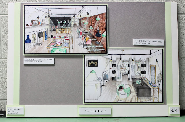 5. Your renderings should be the stars of the show. They will pop more if they are surrounded by a black boarder.


 6. Try not to put all of your boards together in one day or by your eighth board things might start getting a little crooked and sloppy (see above ^).
7. Always dress to match your boards. Just do it.
 Warnings: Doing these boards is costly, time consuming, and will result in major 'designer bags'...and not the good kind of designer bags. I'm talking the ones under your eyes here people. Proof is in the pudding:
 I'm very proud of how far I've come in one short year!! I can't imagine where I will be when I graduate. This week I am visiting my parents in Waterloo before term 5 starts on October 7th!
xoxo

This one was a big one - Each term more is expected of us as our knowledge base grows. I can't believe I'm officially 1/3 done my degree already. How time flies!
Today I thought I would share my final project and some tips for creating professional looking design boards (for all those fellow design students following my blog! xo)


7. Always dress to match your boards. Just do it.


xoxo


